June 3, 2024 – Northern Super League (NSL)
AFC Toronto News Release
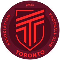
AFC Toronto crest
(AFC Toronto)
Toronto, ON – Today AFC Toronto, the city’s first professional women’s soccer club set to debut
in 2025 in the recently unveiled Northern Super League, is excited to announce the launch of its brand crest and
identity.
AFC Toronto’s brand crest is deceptively simple and modern, yet within its clean lines are layers of stories that pay
homage to the City of Toronto and its diversity, the founders, the grassroots heritage of the organization and ethos
of the club. The inaugural brand crest is a culmination of specific elements that together form its crest:
The ‘anchor T’ (submark logo) is at the centre of the primary crest. It
symbolizes Toronto, the bold angles shooting upwards capture momentum,
forward movement and the rally cry of the club, “Rise up”! The anchor T
is propped up by the mirrored 7’s on either side of the design honouring
the founding seven members of AFC Toronto, and the original 6 boroughs
of Toronto plus the Greater Toronto Area (GTA) that align the club’s
commitment to community.
AFC TORONTO INAUGURAL CREST AND IDENTITY DEFINED
The ‘elemental shield’ (secondary logo) with its eleven strokes, represents
the starting XI on the pitch signifying unity, tenacity, athletic excellence and
the strength of the club on the field. It’s wrapped in a shield, with the upper
and lower strokes that are unbounded to symbolize the club’s commitment
to continually push boundaries while creating an inclusive and fair-play
environment.
These woven parts make the ‘primary crest’. It is a reflection of Toronto,
that includes the club’s starting season year, and pays respect to the global
tradition and the legacy in soccer of using Association Football Club and a
club’s city name within their primary crests. For AFC Toronto, the acronym
takes on a deeper meaning: Always For: Commitment, Change, Courage
and Celebration.
Mighty Maroon: Symbolizing ambition and resilience, this deep red-purple reflects the team’s solid foundation
and toughness.
Victory Vermillion: This vibrant colour embodies energy and passion, capturing the team’s bold and spirited
approach to the game.
A UNIQUE APPROACH
TO BRANDING
“From the very start, we’ve been committed to taking a different approach in the development of our club and its
story, and we knew the key to this was to involve the community and create a brand that was built in Toronto, for
Toronto by Torontonians.” says Jill…
Click Here to Read the Full Original Article at OurSports Central Women's Soccer News…